12 Hotel Room Number Sign Design Ideas
A slim metal bar, a carved vertical plaque and a glowing ceramic flower give the same room number very different personalities. These 12 AeroSignage styles are grouped into six visual comparisons to help you choose a direction for your hotel: compare the outline, the way the numbers sit, and the detail you want to repeat along the corridor.
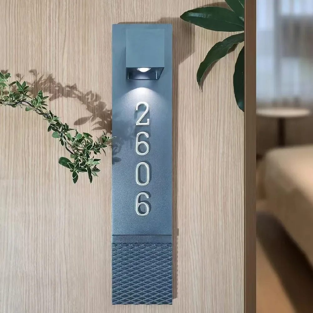
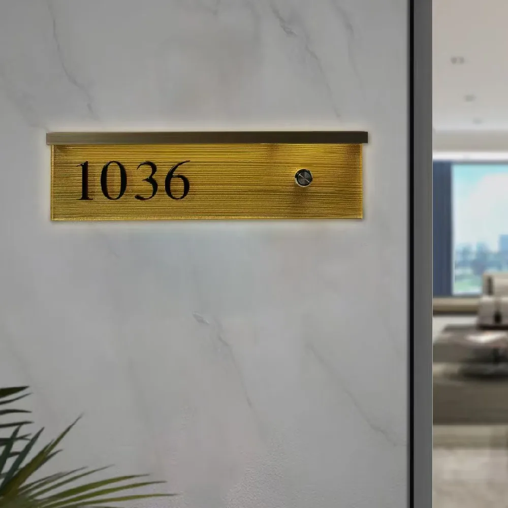
1–2. A tall carved plaque or a wide metallic strip
1. S007-1 puts the digits in a vertical column beneath a small spotlight. A diamond-patterned section finishes the bottom, while the number area stays plain. The CNC-carved aluminum face gives you a useful design idea: concentrate the texture in one part of the plaque and leave the numerals room to breathe. Consider this direction when you want a narrow, upright accent beside the door.
2. H004 stretches across the wall instead. Dark numerals sit toward the left of a warm metallic face, beneath a thin upper light strip. The photographed horizontal grain reinforces its long outline. Choose this composition if you prefer a contained number panel with a wider, quieter shape. Compared with S007-1, the interest comes from the finish and horizontal proportions rather than a patterned base.
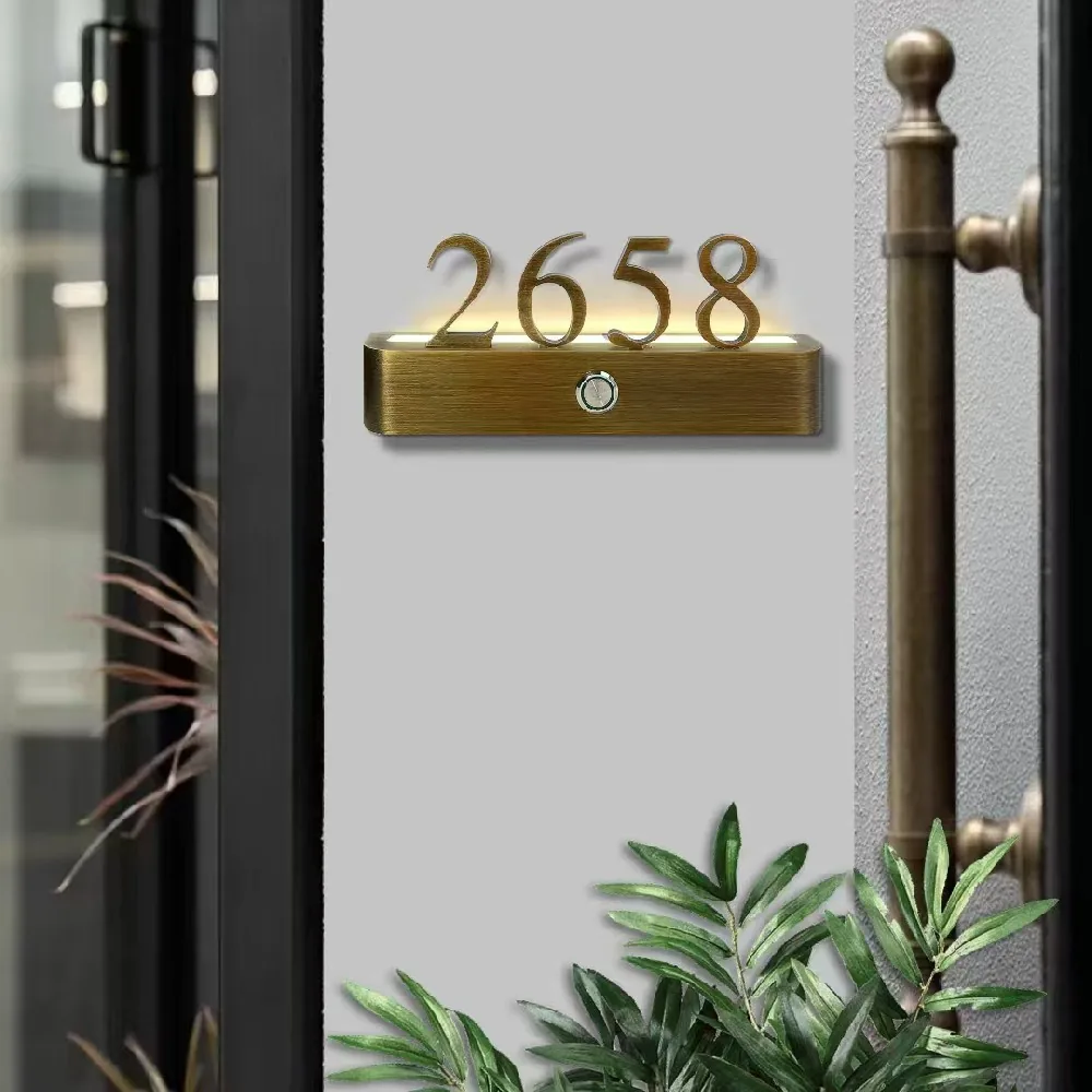
3–4. Standing numerals in warm metal or black and gold
3. H005 lets the numerals rise above a brushed brass-finish base. The digits and base share a warm color, so the design reads as one coordinated piece. Its curved serif numerals add a more decorative note than a plain rectangular number panel. This is a useful reference when the surrounding interior already uses warm metallic details. The brass appearance is a finish on aluminum.
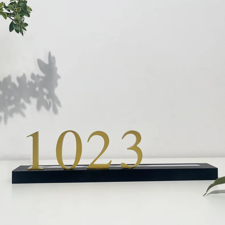
4. H008-1 keeps the standing-number idea but separates gold-colored digits from a slim black bar. More of the surrounding wall remains visible between the numerals, and the darker base draws a firm line underneath them. Compare these two if you like exposed numbers: H005 emphasizes a matching metallic body; H008-1 emphasizes the contrast between the number and its base.
5–6. A silver bar or a transparent artwork disc
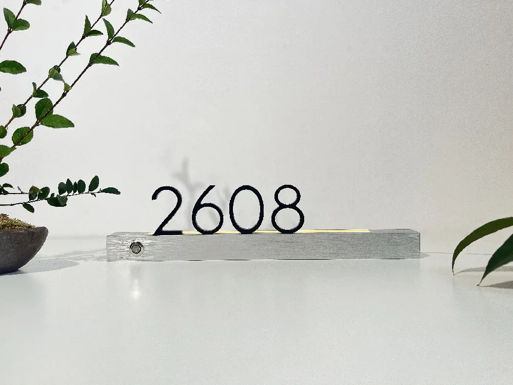
5. H008-2 places dark standing digits on a silver-colored brushed bar. Compared with H005's matching warm metal, this pairing looks more restrained: the number is the main dark shape and the base is a simple horizontal line. It offers a starting point for an interior built around pale walls, silver hardware or cool neutral colors.
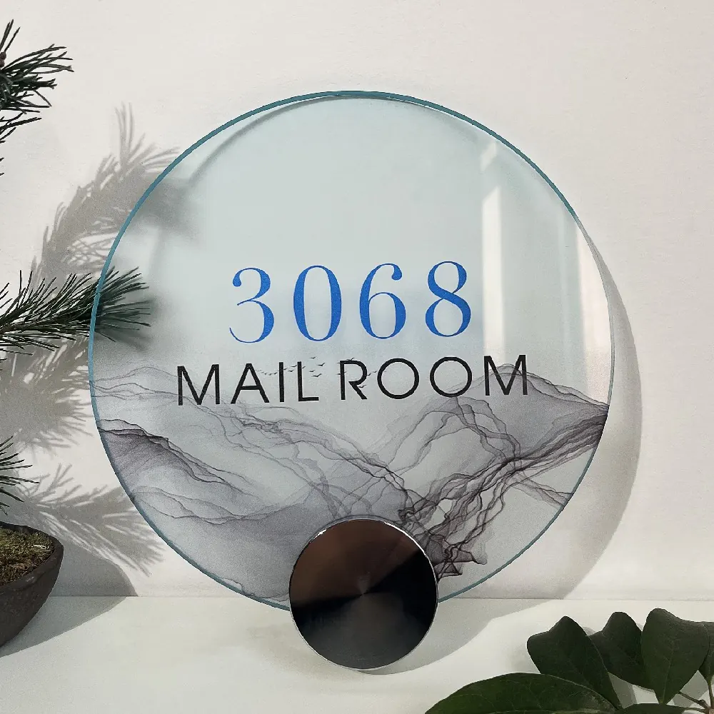
6. Y010-2 takes a different route to a light-looking composition. Its clear acrylic disc carries blue numerals above black wording, with an ink-wash landscape across the lower area. The example reads MAIL ROOM, making it particularly useful when thinking about numbered amenity doors as well as guest-room signs. Choose the bar for a number-led design; consider the disc when artwork and a room name should share the face.
7–8. A glowing diamond or a round reflective disc
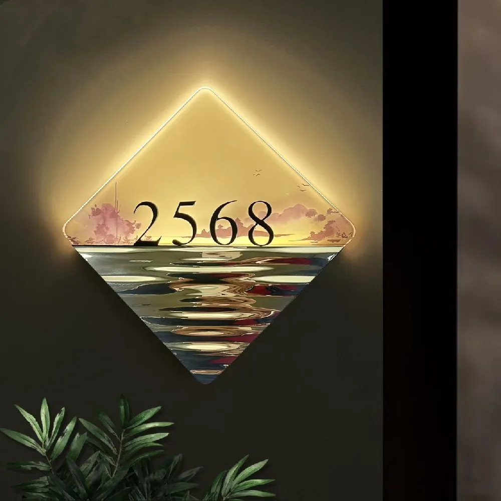
7. F003 combines a pointed diamond outline, a printed landscape and a rippled, mirror-like lower half. The number sits along the division between the two surfaces. Its glowing upper edges emphasize the diamond outline, so shape is a major part of the idea. This is a more expressive reference for a suite or a hotel concept that already uses artwork and decorative lighting.
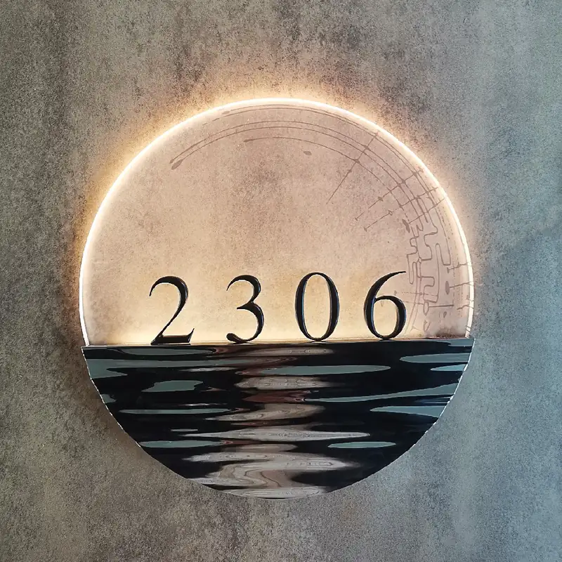
8. Y003 uses a circle with a lit upper edge and a reflective lower portion. A faint line pattern sits behind the numerals, creating a gentler graphic than F003's landscape. Both examples divide the face horizontally; the choice is whether you want the sharp diamond and pictorial scene, or a round outline with subtler background detail. Keeping that one shared division can help compare them without being distracted by color.
9–10. A glazed ceramic oval or a painted metal oval
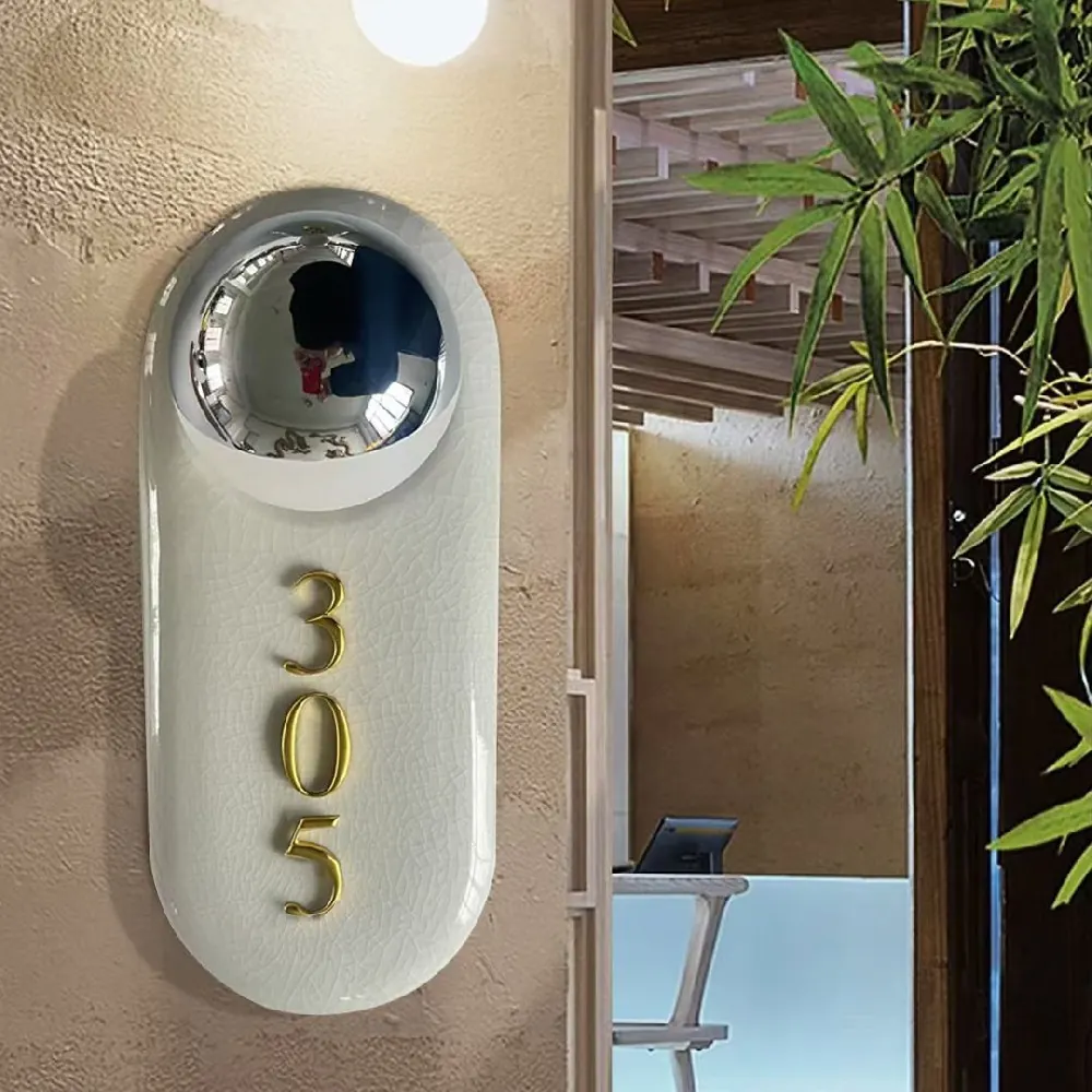
9. Y007 places a mirror-like dome above vertically arranged gold-colored numerals on an off-white ceramic oval. The visible crackle glaze adds fine surface detail, while the rounded ends soften the outline. It is a useful reference for a palette built around ceramic, plaster and natural-looking textures.
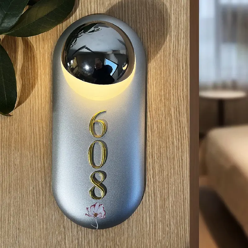
10. Y001 shares the oval, dome and stacked-number arrangement but uses painted aluminum. In the pictured version, a blue-gray face and a small floral motif near the bottom give it a different character. Compare the surface rather than just the silhouette: Y007's glaze provides the decoration; Y001 puts more emphasis on the chosen paint color and a small graphic accent.
11–12. An organic glowing face or a ceramic flower
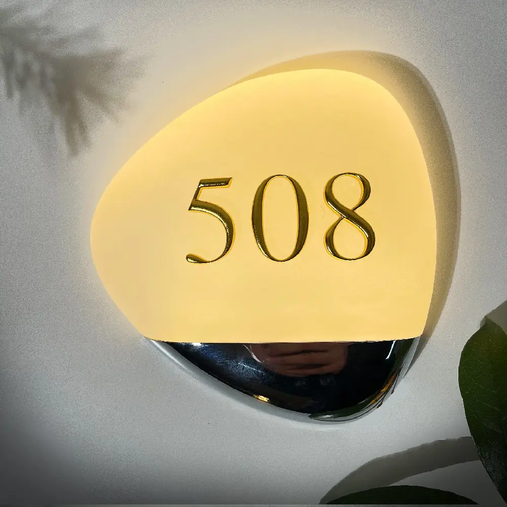
11. Y008 uses an asymmetric, pebble-like face with a warm glow, gold-colored numerals and a reflective lower accent. The uneven outline does much of the decorative work, leaving the central number area uncluttered. Consider it if you prefer a soft, organic shape without a literal floral pattern.
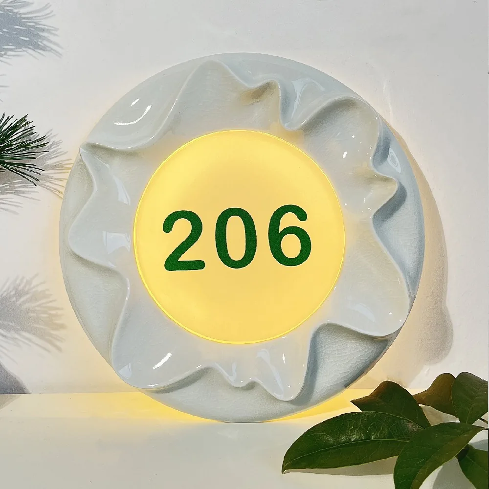
12. Y002 is more explicit: a glazed ceramic flower surrounds a luminous circular center. The example's dark rounded digits sit inside that center, separate from the sculpted petals. This gives a garden or botanical interior a direct visual connection. The comparison is simple: choose Y008 for an abstract natural form, or Y002 when the flower itself should be the recognizable motif.
Choose the feature you want to explore
| Visual direction | Start with | What to compare |
|---|---|---|
| A contained metallic plaque | S007-1 · H004 | Vertical carved texture or a wide horizontal face |
| Warm standing numerals | H005 · H008-1 | A matching metallic base or a contrasting black bar |
| A lighter-looking composition | H008-2 · Y010-2 | Open numerals or a transparent face with artwork and wording |
| A decorative illuminated outline | F003 · Y003 | A landscape diamond or a round split-face design |
| An oval with a sculptural accent | Y007 · Y001 | Ceramic glaze or a painted face with a small motif |
| A nature-inspired form | Y008 · Y002 | An abstract pebble or a recognizable ceramic flower |
Turn twelve ideas into a two-style shortlist
Start with the feature you want to carry through the interior. For exposed numerals, compare H005 with H008-1. For a textured vertical plaque, compare S007-1 with Y007. For artwork and a distinctive outline, compare F003 with Y003. Selecting two references with a clear difference is more useful than collecting twelve favorites.
Then compare both against the same door and wall palette. Decide which finish belongs with the existing hardware, whether the number or the whole plaque should attract attention, and whether you want artwork, texture or a clean background.
Key takeaways
- Choose a visual direction first: exposed numbers, a framed plaque, artwork or a sculptural shape.
- Compare two styles against the same interior palette to make their differences easier to judge.
- Use the model code and the feature you like to begin adapting a reference design.
FAQ
Which examples are a starting point for minimalist hotel room signs?
H008-2 and H008-1 keep the main composition to standing numerals and a horizontal bar. H008-2 pairs dark numbers with a silver-colored base; H008-1 pairs gold-colored numbers with black. Compare those color relationships with your interior before choosing.
What can I choose instead of a rectangular room-number plaque?
This collection includes the F003 diamond, Y003 and Y010-2 discs, Y007 and Y001 ovals, the Y008 pebble-like form and the Y002 ceramic flower. Their outlines give you different starting points without needing to add more text or ornament.
Can a sign include a room name as well as a number?
Y010-2 shows that arrangement with 3068 above MAIL ROOM. It is a reference for combining a number, a name and artwork on one face. Other wording can be discussed as part of the layout.
Are the gold-colored examples made from solid brass?
Color alone does not identify the metal. H005 uses brass-finish aluminum, and H008-1 uses aluminum with gold-colored numerals in the pictured version. Choose the appearance you like and keep the base material distinct from its finish.
Sources and review scope
Supplier-specific statements use clearly identified first-party AeroSignage materials.
- AeroSignage catalog and workshop media (first-party)
- AeroSignage manufacturing capability documentation (first-party)
Local codes, accessibility requirements, engineering details, and order-specific claims must be confirmed for the destination market before production.
Hotel Room Numbers
Buyer path for this topic
Keep the detail you like and adapt the design
A useful starting point can be as specific as the vertical layout of S007-1, the black-and-gold contrast of H008-1, or the printed landscape on Y010-2. Identify that feature first, then discuss how your room numbers, wording or preferred color could work with it. A reference style gives the conversation a concrete direction.
For carved metal designs, AeroSignage uses CNC carving rather than casting. S007-1 is one example of a carved face; the wider collection also includes assembled metal, acrylic and ceramic designs. The construction follows the selected style. Send your preferred model code or a reference image to begin a private quotation discussion.