Hotel Restroom Signs: Figures, Plaques or Lighting?
Choose separate figures when you want the wall to remain part of the composition, an oval plaque when you want a defined background around the icon, or a lit design when illumination and pattern are part of the intended effect. Then compare the shape itself: a rounded copper-colored figure and a faceted silver one differ in more than their finish.
Start with the space around the symbol
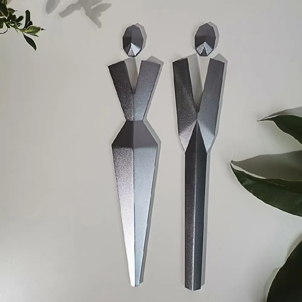
In the P002 photograph above, the pale wall fills the gaps between the figures and continues around their edges. There is no rectangle or oval separating the sign from the room. The long, angular forms are the objects you are choosing; the wall supplies the background.
That is an attractive option when you want to keep a visible wall finish around the sign. It also means that the background in the catalog photograph is not supplied with the figures. A different wall color or pattern becomes part of the finished composition. If what you like is the pale area surrounding the icon, decide whether your own wall provides it or whether you actually want a plaque.
An independent figure and an icon on a plate can share a similar outline yet produce different results. Begin with that format choice before narrowing the selection to a metal color. It prevents you from choosing a beautifully shaped object and then adding a backing simply to recreate the picture that attracted you.
P001 and P002 change more than the metal color
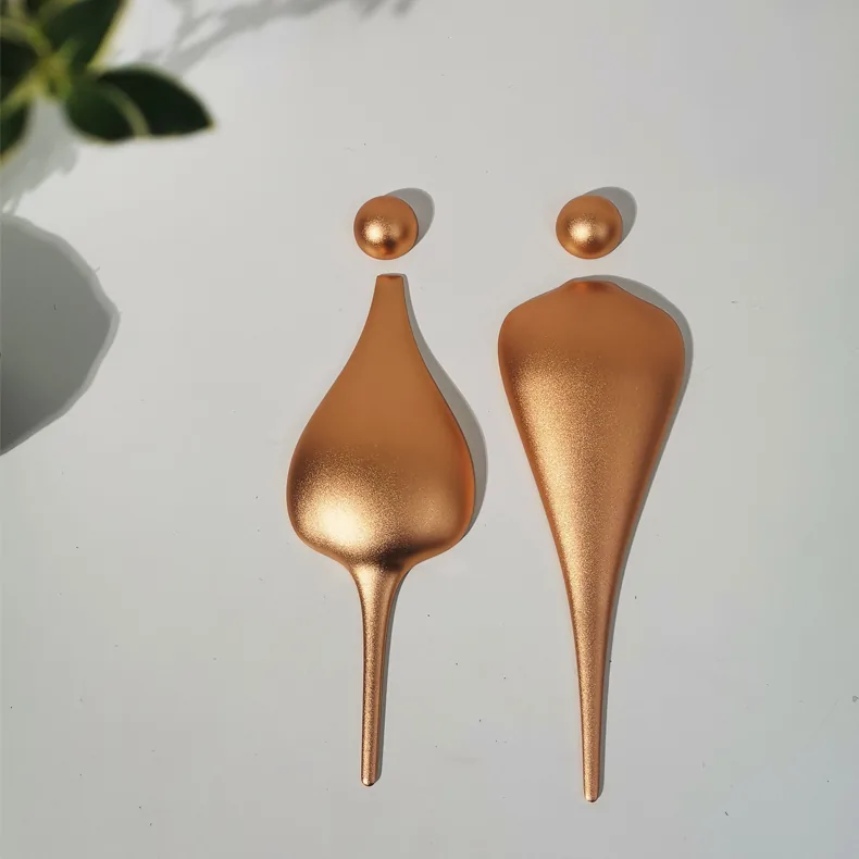
P001, shown below, has round heads and bodies that swell into smooth teardrop forms. P002 has angular heads, straight edges and distinct planes running through the body. The photographs show gradual highlights on P001 and separate bright and dark faces on P002. That difference comes from their form, not just copper versus silver.
Both styles use CNC-carved aluminum. P001 has a copper-colored finish; P002 has a brushed-silver finish. The shared base material does not give them the same character. If you want rounded volume, P001 is the useful starting reference. If the appeal is the sharply folded appearance, keep P002's facets in the brief.
Changing P001 to a cooler color would not create P002's geometry. Equally, a warm finish would not make angular planes into rounded surfaces. Choose the shape you want to preserve, then discuss its finish. This makes a more precise design choice than asking for a luxury metal restroom sign.
Which feature should lead the design?
| Starting reference | Choose it for | A different choice may suit you if |
|---|---|---|
| P002 faceted figures | Angular planes and separate figures with the wall visible around them. | You want soft, rounded surfaces or a plaque that provides its own background. |
| P001 rounded figures | Round heads and smooth teardrop bodies with a copper-colored finish. | The sharply folded appearance is the feature you want to preserve. |
| OV-03 oval plaques | A complete pale background and a defined outline around the icon and wording. | You want the wall to remain visible between the parts of an independent figure. |
| LT-04 illuminated design | Patterned luminous figures and a glowing word bar as one decorative composition. | You want the quieter appearance of plain metal forms without an illuminated pattern. |
Choose a plaque when you want its own background
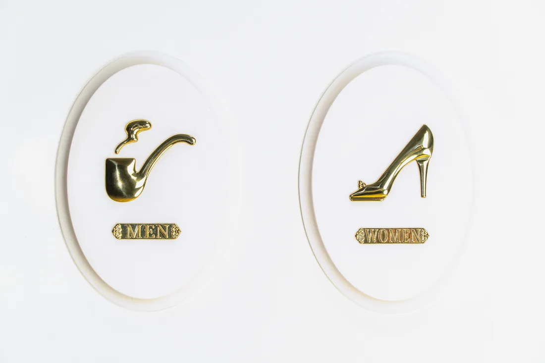
OV-03 encloses its gold-colored icons and MEN or WOMEN labels within white oval plates. The painted aluminum oval supplies a complete visual field: a defined edge, a pale background and space around the graphic. That arrangement changes the sign even before you choose the particular icon.
For an interior where you want a small, self-contained decorative object, the oval is part of the attraction. It gives the icon a composition of its own instead of letting the wall continue through it. Removing the oval would therefore be a substantial design change, even if the pipe or shoe remained the same.
The reverse is also worth considering. If your aim is a pair of sculptural figures directly against the wall, adding an oval or rectangular plate introduces a second outline. Choose that extra shape because it contributes something you want, rather than assuming every restroom symbol needs a backer.
Treat LT-04 as a patterned light feature
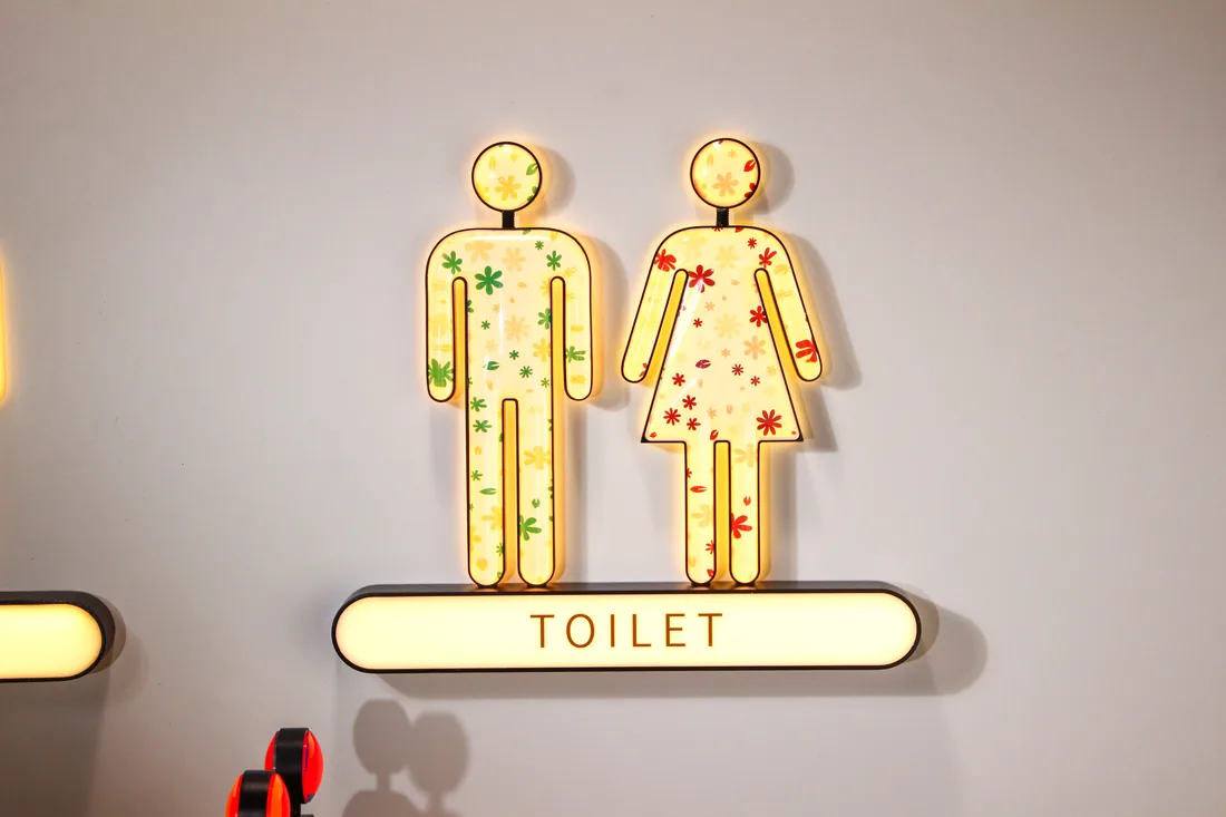
LT-04 puts floral graphics inside illuminated figure shapes, with a glowing TOILET bar underneath. The green and red motifs belong to the faces of the figures. Light, pattern and outline work together; the result is quite different from a plain metal figure with a lamp added nearby.
Its listed construction is an aluminum housing with acrylic faces and internal LEDs. This provides a different design reference from P001 and P002, where the visible interest comes from the metal surfaces and their shape. If the floral imagery is what draws you to LT-04, retain that as an explicit part of the choice instead of reducing the request to a backlit restroom sign.
For a restrained interior, the extra pattern may be more decoration than you want. For a setting where the sign is intended to be a colorful feature, it may be precisely the point. Illumination does not automatically improve the design; decide whether the luminous patterned face belongs in the room you are designing.
Make the shortlist a real choice
A useful shortlist might put P002 beside OV-03 because you are deciding whether to expose the wall or introduce a pale oval. Or compare P001 with P002 because rounded volume versus facets is the unresolved part of the interior scheme. Each pair asks a different question; choose the one your room design has not yet answered.
Keep the feature you care about visible in that comparison. If all four designs appeal for different reasons, name those reasons first: an angular object, a rounded object, a complete plaque, or a patterned light. Combining every feature into one sign could remove the simplicity that made the individual examples appealing.
Key takeaways
- Choose whether the wall or a plaque should supply the background around the symbol.
- Decide between rounded forms and angular facets before choosing the metallic finish.
- Treat illumination and internal graphics as part of the design, rather than an automatic upgrade.
FAQ
Are separate restroom figures or a full plaque better?
They create different compositions. Separate figures leave the wall visible around and between their parts. A full plaque supplies its own background and outer shape. Choose according to which of those effects you want in the interior.
Are P001 and P002 just different metal finishes?
No. Both are CNC-carved aluminum styles, but P001 has rounded heads and teardrop bodies, while P002 uses angular facets. Their copper-colored and brushed-silver finishes are separate choices from that difference in form.
Should every decorative restroom sign be illuminated?
No. LT-04's lit floral faces are a specific visual choice. If you prefer plain metal shapes or a self-contained oval plaque, adding illumination may change the feature you liked rather than improve it.
Can I choose any pictured pair for a single-user or family restroom?
Use wording and symbols appropriate to the actual room designation rather than copying a pictured pair unchanged. The selected appearance also needs to be developed with the applicable identification requirements; a decorative or three-dimensional icon alone does not establish compliance.
Sources and review scope
Supplier-specific statements use clearly identified first-party AeroSignage materials.
- AeroSignage catalog and workshop media (first-party)
- AeroSignage manufacturing capability documentation (first-party)
Local codes, accessibility requirements, engineering details, and order-specific claims must be confirmed for the destination market before production.
Hotel Signage Package
Buyer path for this topic
Keep the room's identity separate from the styling
Choose the wording and symbols for the actual room use. Separate men's and women's rooms, a single-user restroom and a family restroom do not become interchangeable because a particular pair of decorative figures looks attractive. A design reference is a starting point for the appearance, not a decision about who the room serves.
For US projects covered by the ADA Standards, permanent restroom identification and directional information have different requirements. Where a pictogram designates a permanent room or space, the Standards require a raised-text and braille descriptor; the pictogram itself does not have to be raised. These photos do not establish compliance, and giving a sign a decorative style does not remove its identification responsibilities.
Explore the restroom styles to select a starting format. If the next decision is how that choice belongs with room numbers and directions, our hotel wayfinding guide takes up the wider set.